Role:
UI Designer | User Journey | Interview | Content Writer | User Testing
Tools:
Adobe XD | Adobe Illustrator
App Walkthrough
Overview and Process
The purpose of the project is to redesign the existing myHumber app which is designed for students’ convenience.However, for many reasons, there are students who barely use it and do not even know that it exists. This project will make it user friendly based on the experience of many students so that student can use an app easily.
Our group decided to walk around campus and ask students what they think of the MyHumber app. Although some students said that they think that the app is useful and easy to use, most of the students we interviewed dislike it due to its poor design and confusing navigation bar. Based on our interview we figured out the pain points that users face and decided to re-design the app to make it easier and more convenient to use.
Target Audience
Primary: First Year students who do not know where their classes and facilities and are located.
Secondary: second or third year students who are still unfamiliar with the events and facilities around campus.
The Interview
The Solution
To re-design the myHumber app and only include the features that students use frequently as well as changing the layout in order to make it clearer.
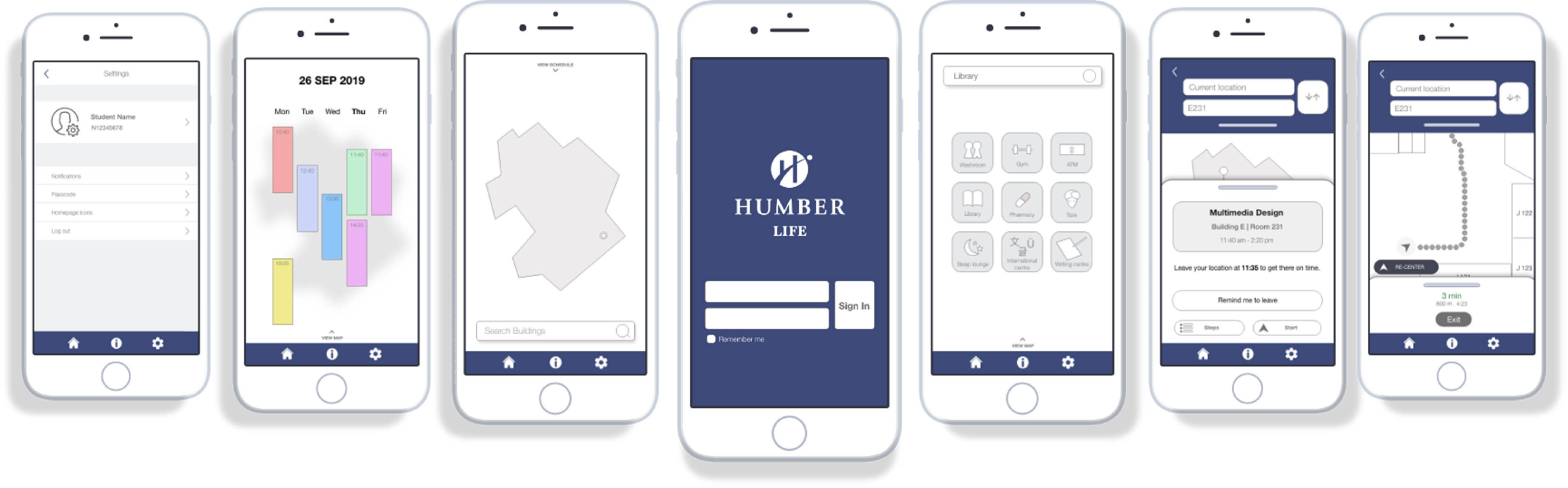
Low Fidelity Prototypes
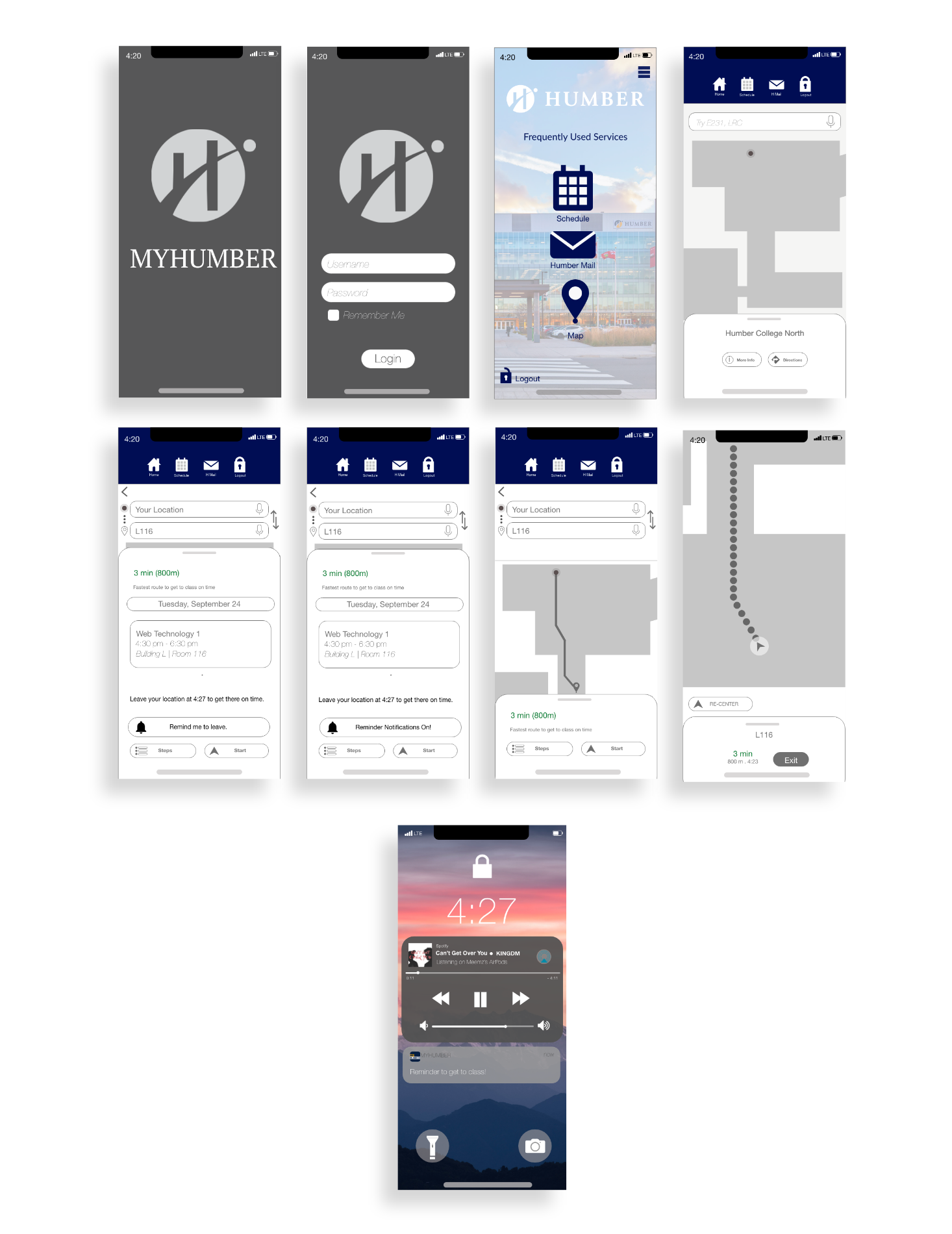
High Fidelity Prototypes

User Testing
Revisions and Changes
1. Schedule page:
- Add a label for viewing schedule
- Add an icon to go back to previous page
- Add an icon to go back to previous page
2. Main Page:
- Change the options from blackboard and transit to Humbermail and Schedule.
3. Push Notifications:
- Change the notification message to display the class name
- Add notifications for events and promotions at campus
- Add notifications for events and promotions at campus
Final Prototype